HIRAETH
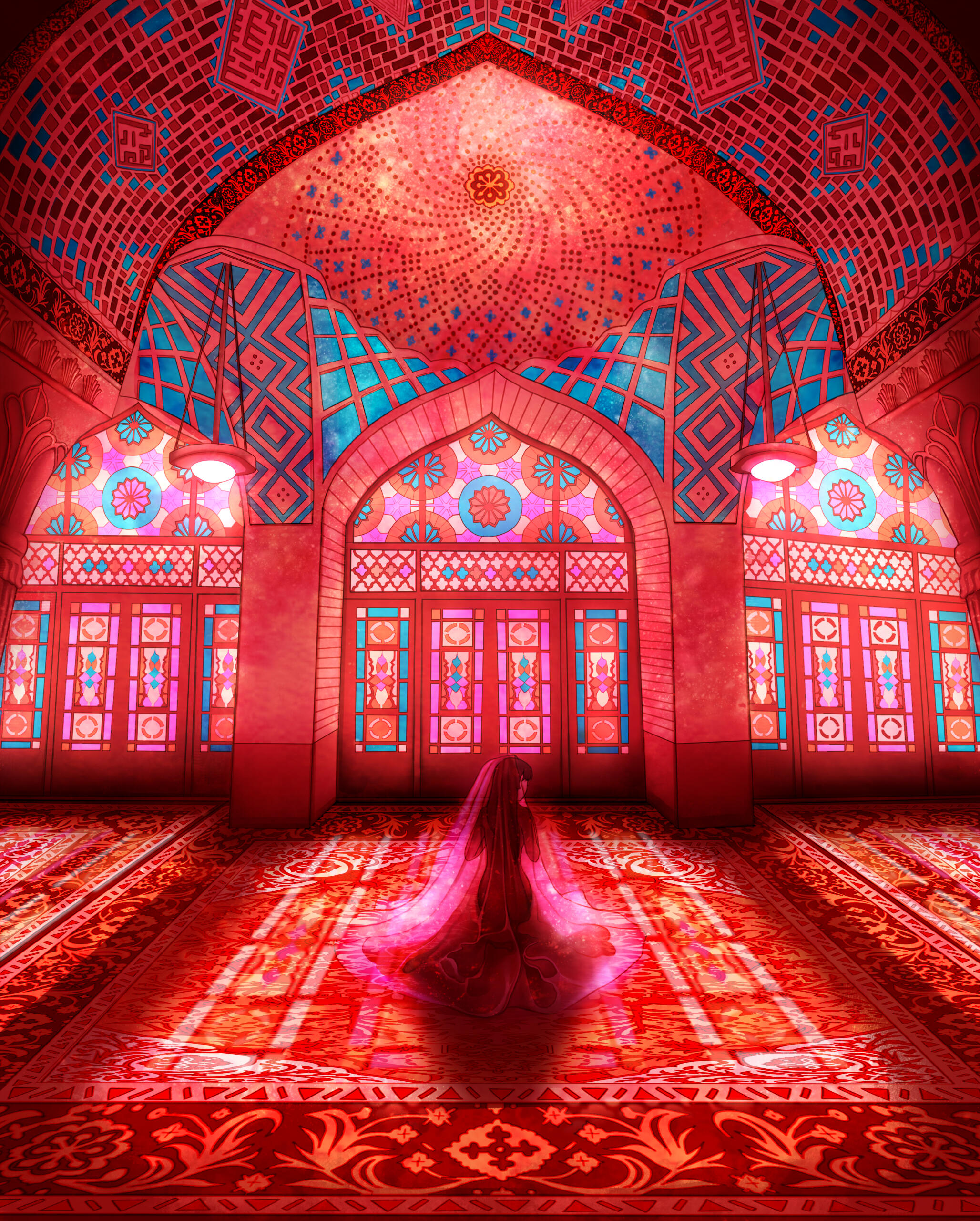
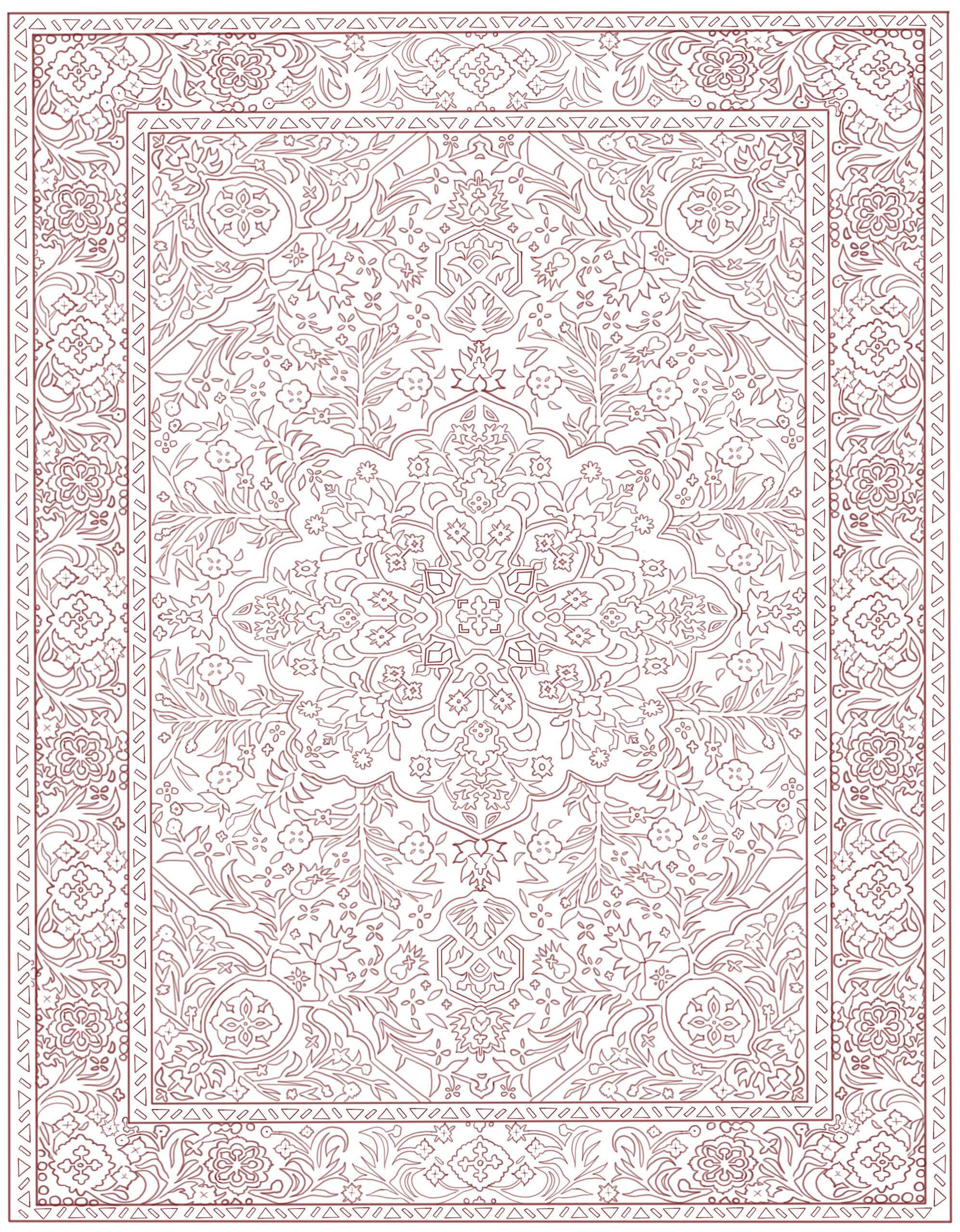
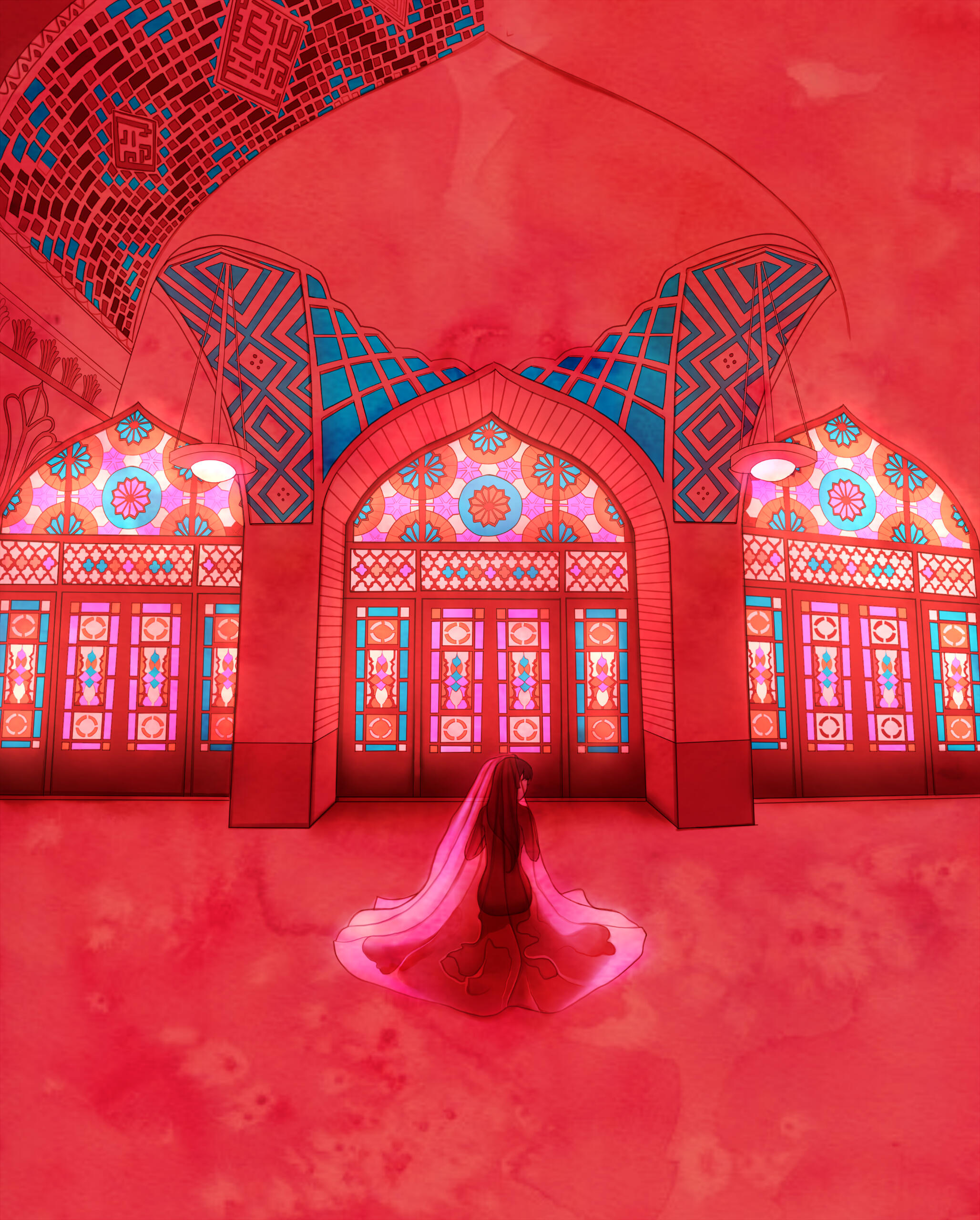
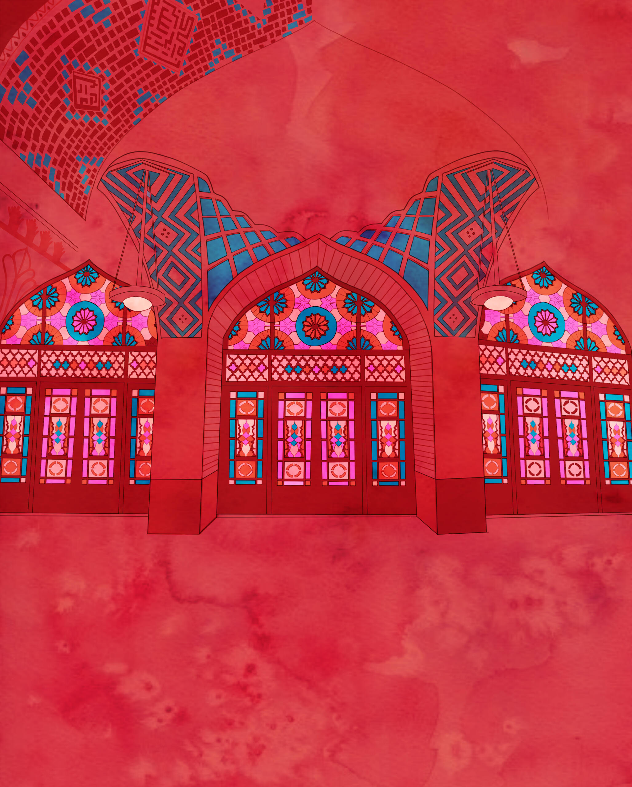
hiraeth (n): a yearning for a home to which you cannot return, or never wasThis drawing references a place of religious trauma for me. I've always had a complicated relationship with my muslim parents, growing up — but I've always thought that islam, and the architecture it carries, is undeniably beautiful. In a sense, it's a home of mine. But not one that I could ever return to. Process-wise, I used the Nasir Al-mulk mosque as a reference! I started with heavy lineart and then played around with lighting + shadows before adding in colors using a watercolor base.
2023 BINGQIU REVERSE MINIBANG
The 2023 Bingqiu Reverse Minibang is an event I am grateful to have been a part of! During this event, artists and writers work together to curate fan-content based on a prompt that the artist creates. Here, I blended various art styles to create the vision of a "Game World" — primarily the watercolor style of Gris, game sceneries of Shelter, and old vintage textures to emulate 90s console game covers.
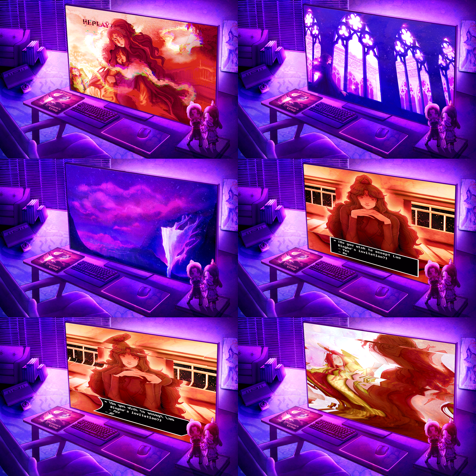
This project utilized my most familiar art style, derived from both animated media and traditional painting styles. I like to explore intense expressions, vibrant colors, fantastical landscapes, and dynamic poses. For me, interpersonal relationships & conflict are some of the most interesting things to explore in artwork — from mundane scenes of pure, unadulterated love to more complex depictions of friends mid-argument. These drawings were all drawn in either Paint Tool Sai or Procreate and animated in Photoshop.
PROCESS
With these works, I started with lineart before blocking out dark / light values in sections, using lineart as a guideline. Objects that are backlit by powerful light are emphasized with some bleed where the light hits the shadow. You can see that technique being used in the windows and stylistically on the people. Overall, I made sure to match the value of the characters to their overall placement in the piece.
SHELTER STUDY
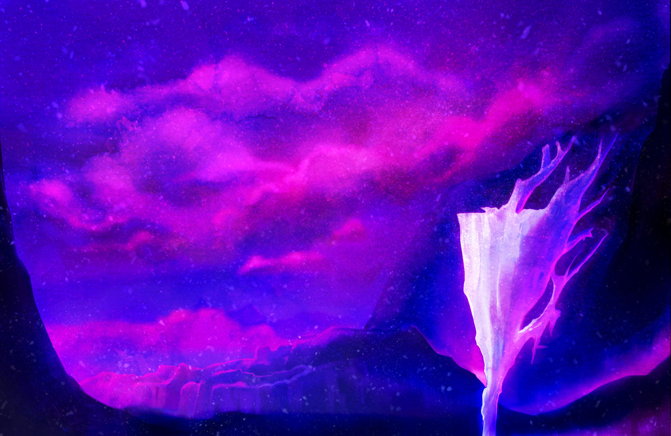
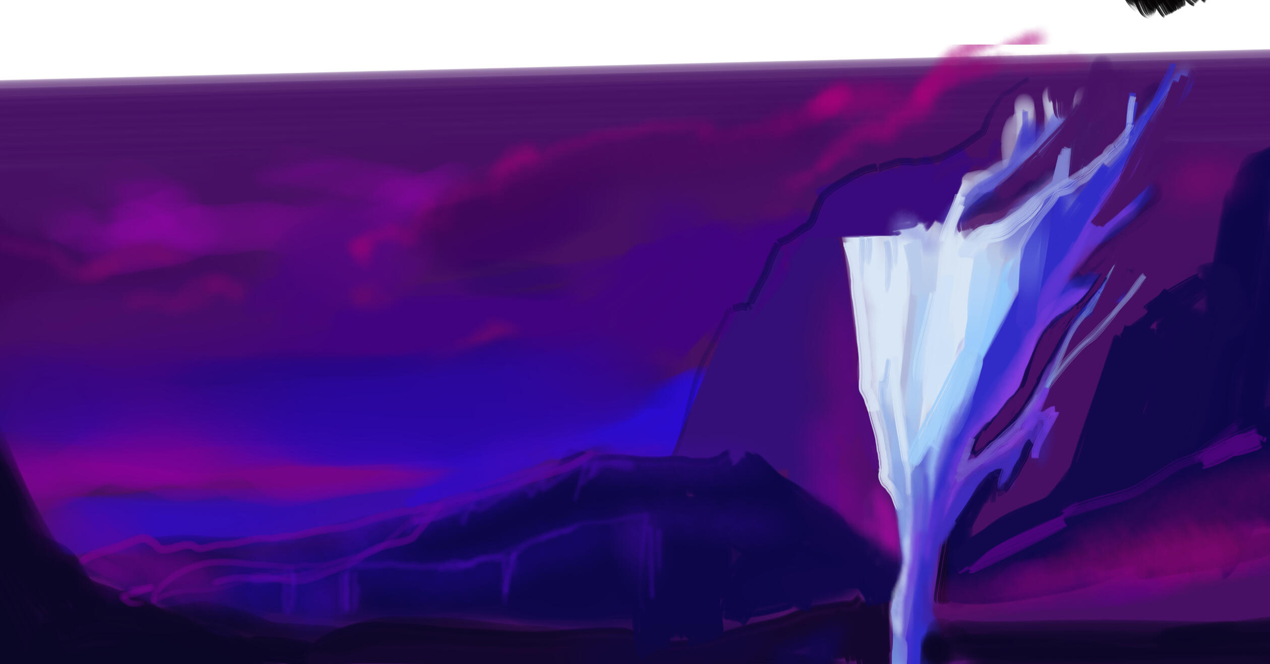
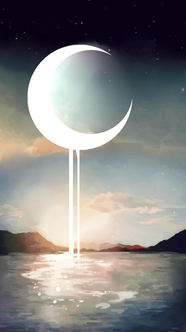
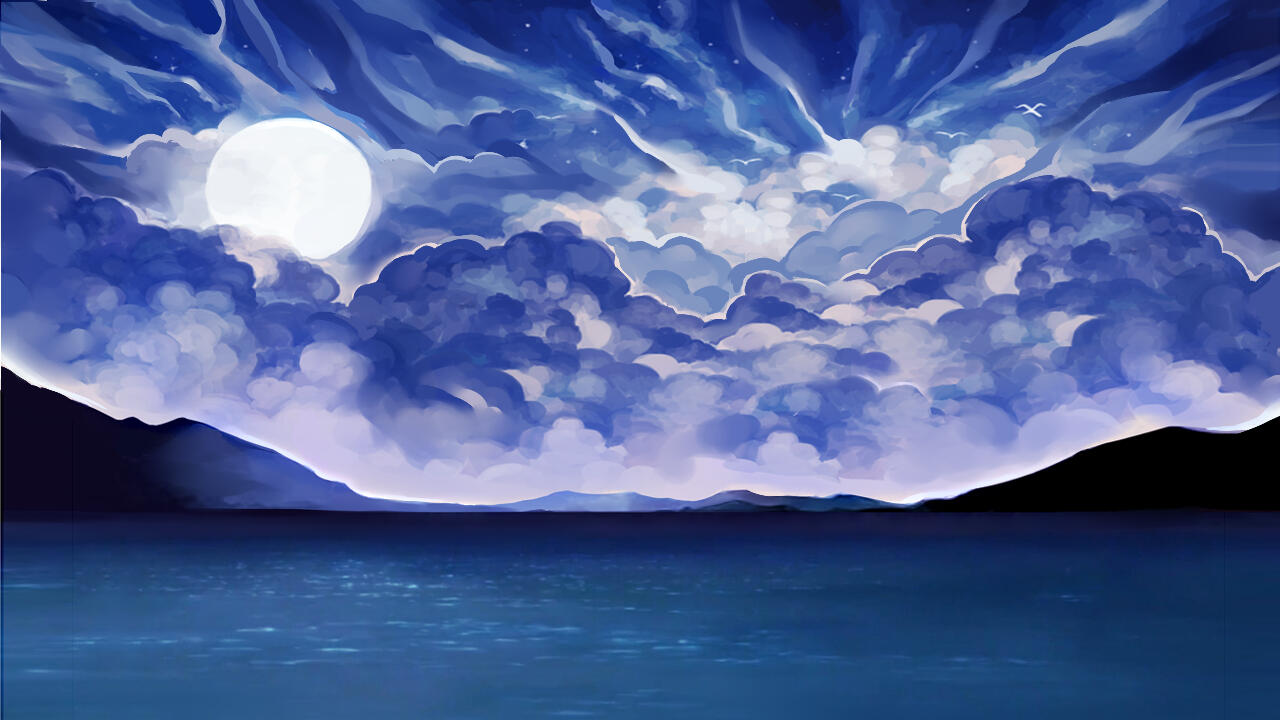
This is an abstract scenery study based on the short film Shelter by Porter Robinson. Here, I filled out main blocks of colors before adding in details, texture and lighting.
CTC STUDY
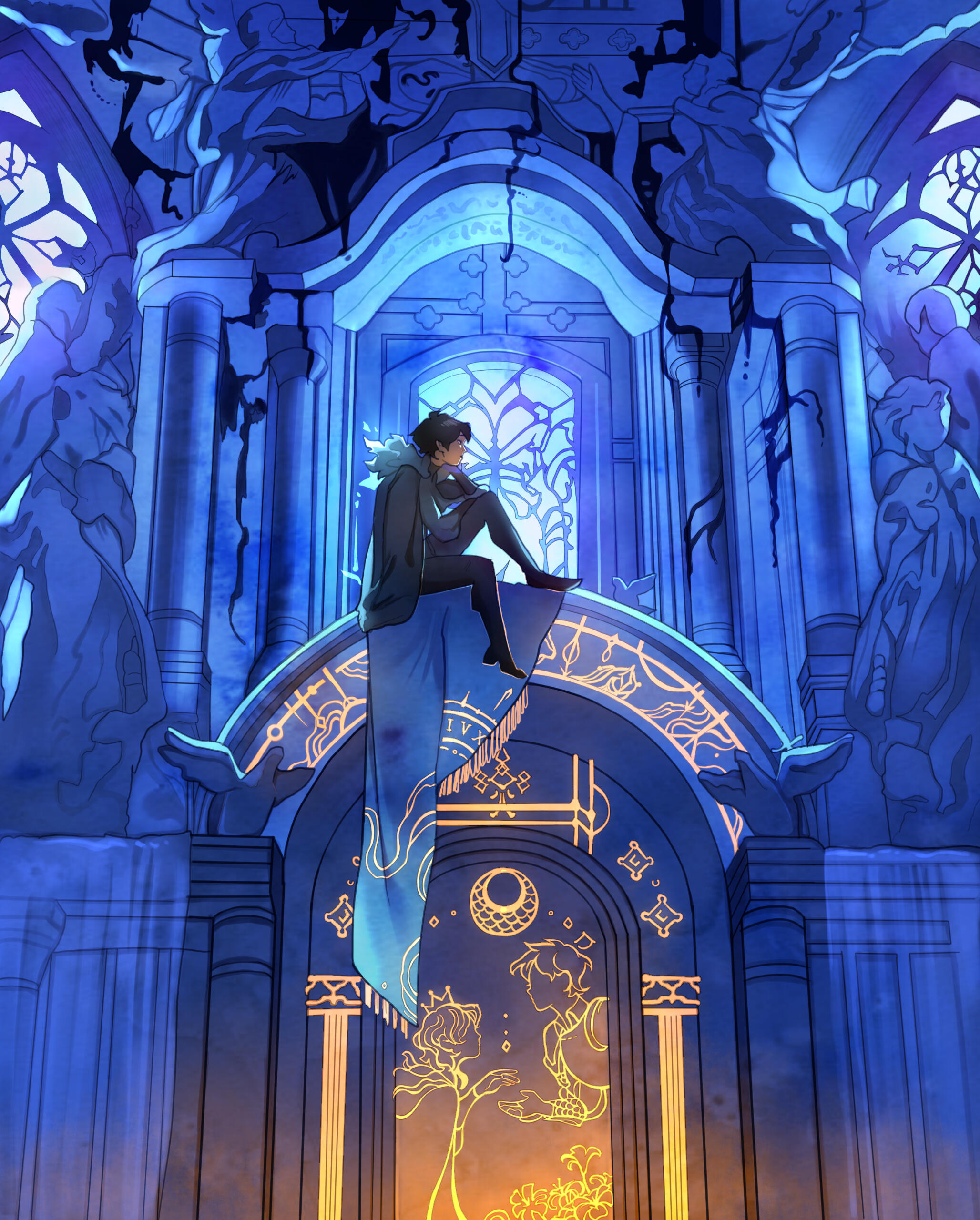
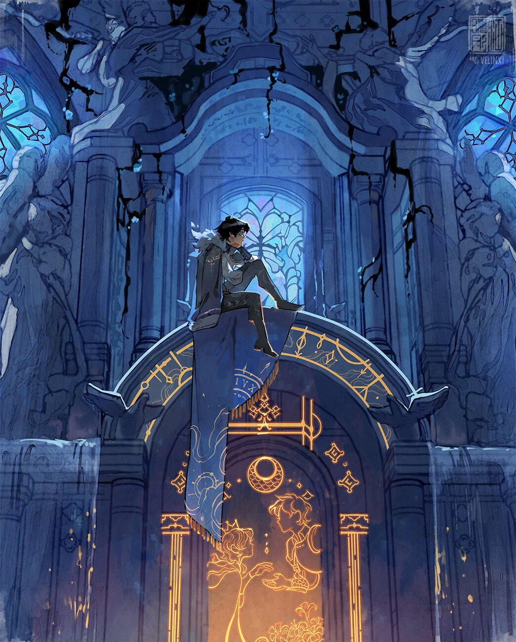
The piece on the left is a master study of Xiao Tong's (Velinxi on twitter) artwork on the right; I learned and replicated an architectural piece of her Countdown to Countdown artwork to understanding value in larger architectural works.
PERSONAL COMPLEXITY
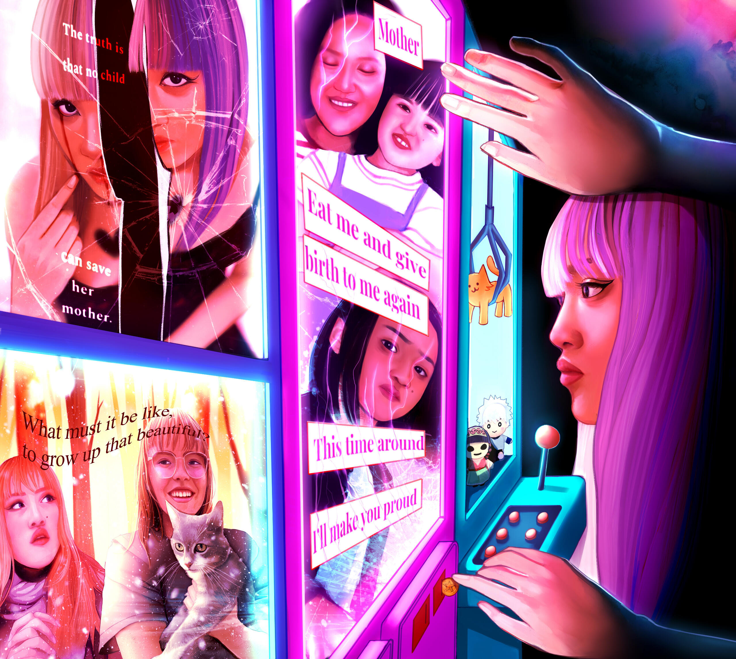
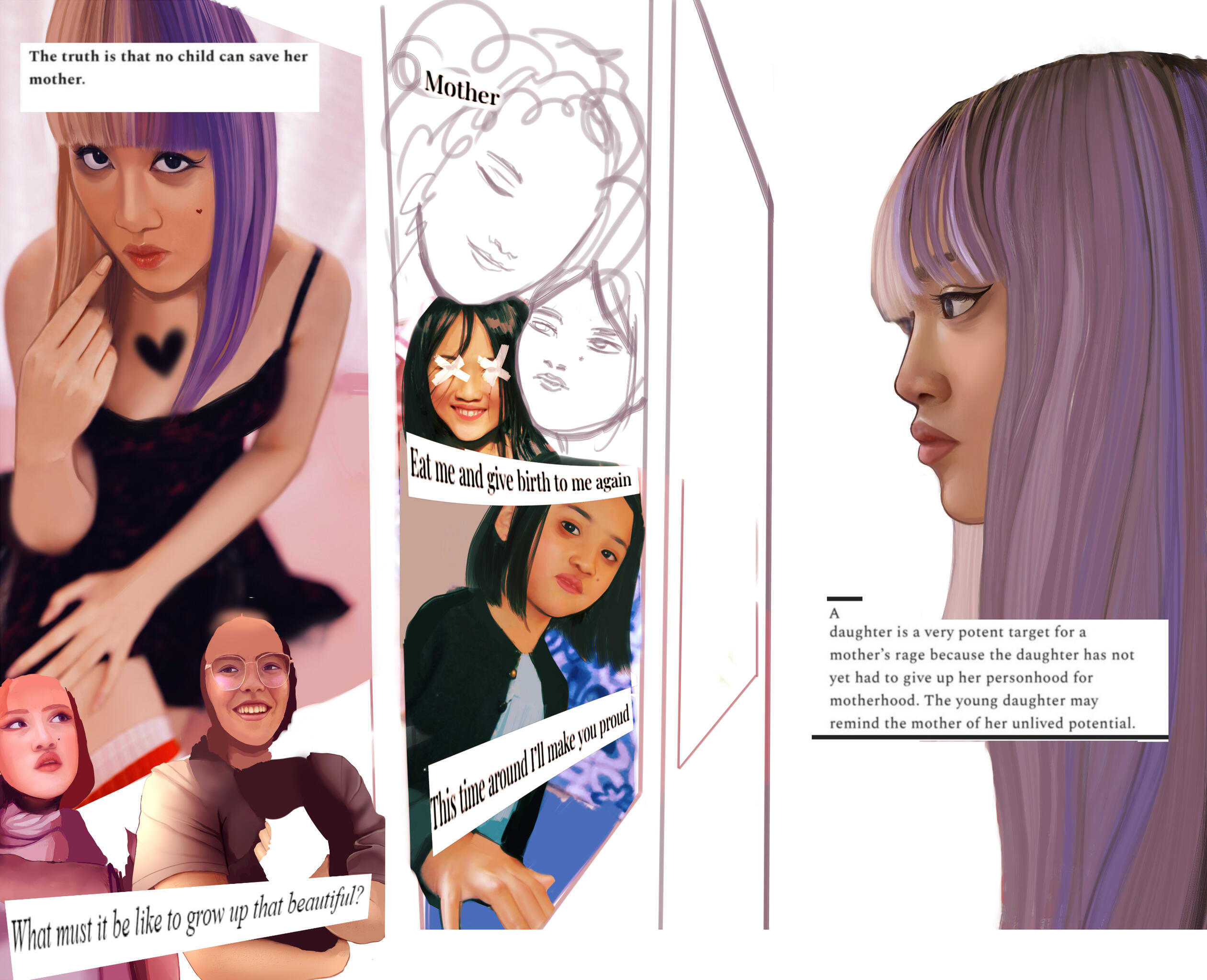
This project focused on one's perception of self. I toyed with the idea of memory fragmentation through arcade screens — a fond medium of my past as an avid gamer.
Aida Must
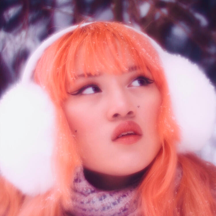
Aida Must is an artist, designer and animator studying Digital Technology and Culture. You can find her scribbling away at passion projects with her business partner Zhongli — a determined Maine Coon cat who keeps her in check. Intersectionality has always been a strong point of interest for her — as an Indo-Japanese American, various cultural roots play a role in her designs. Through her creative works, she hopes to highlight the stories of marginalized communities.
Aida Must has always considered herself to be a cultural artist first and foremost. As a second-generation daughter to immigrant parents, the concept of “borders” has always existed as a liminal space to her, both as a person and a designer. This raises the question: as an artist, what does it mean to exist between boundaries of identities? How does this translate into artwork?A close friend of hers — let’s call her Stormy, for anonimity’s sake — once asked what Aida’s favorite color was. She replied:“Yellow.”Stormy’s face lit up in a smile. “Oh? That’s really nice!”She doesn’t ask why. But if she did, Aida would answer with memories. Would reminisce over her mother’s bright-canary sundress, would tell stories of the dandelions that used to bloom in the fields of her old elementary school. They’re just weeds, her father would say, I don’t get why you bother with them. But her mother would call them beautiful, would kiss Aida on the forehead when she picked them for her; when she kept them watered in that ancient, cracked hospital vase. Aida would tell her about the old lemon-tree in her grandmother’s yard, would tell her about the yellow raincoat she wore on cloudy days, would tell her about the sunflowers she dreamt about ages ago, after meeting a loudmouth girl with a quirky, sunshine smile.Identity is nurtured from these fragments of moments, suspended in time — captured in the mundane. Aida gravitates towards art that depicts the smaller moments in life: from a child’s first snow, to the tender hold of a mother, to the sound of a loved one laughing their lungs out on a bamboo bench.There is so much distance from Indonesia, to Japan, to America — both literally and metaphorically. But cross-culturally, Aida finds that love always, always manifests the same.
LANDSCAPES
Gold Rush
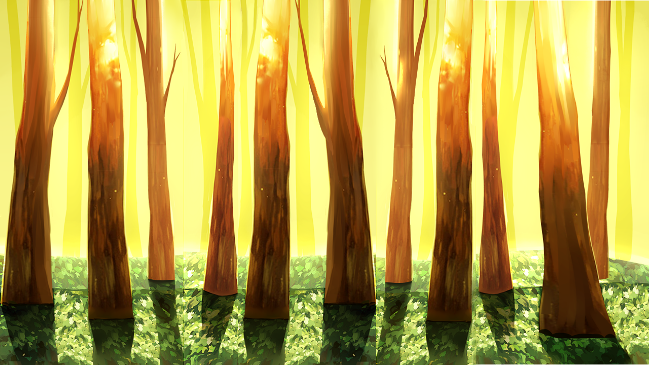
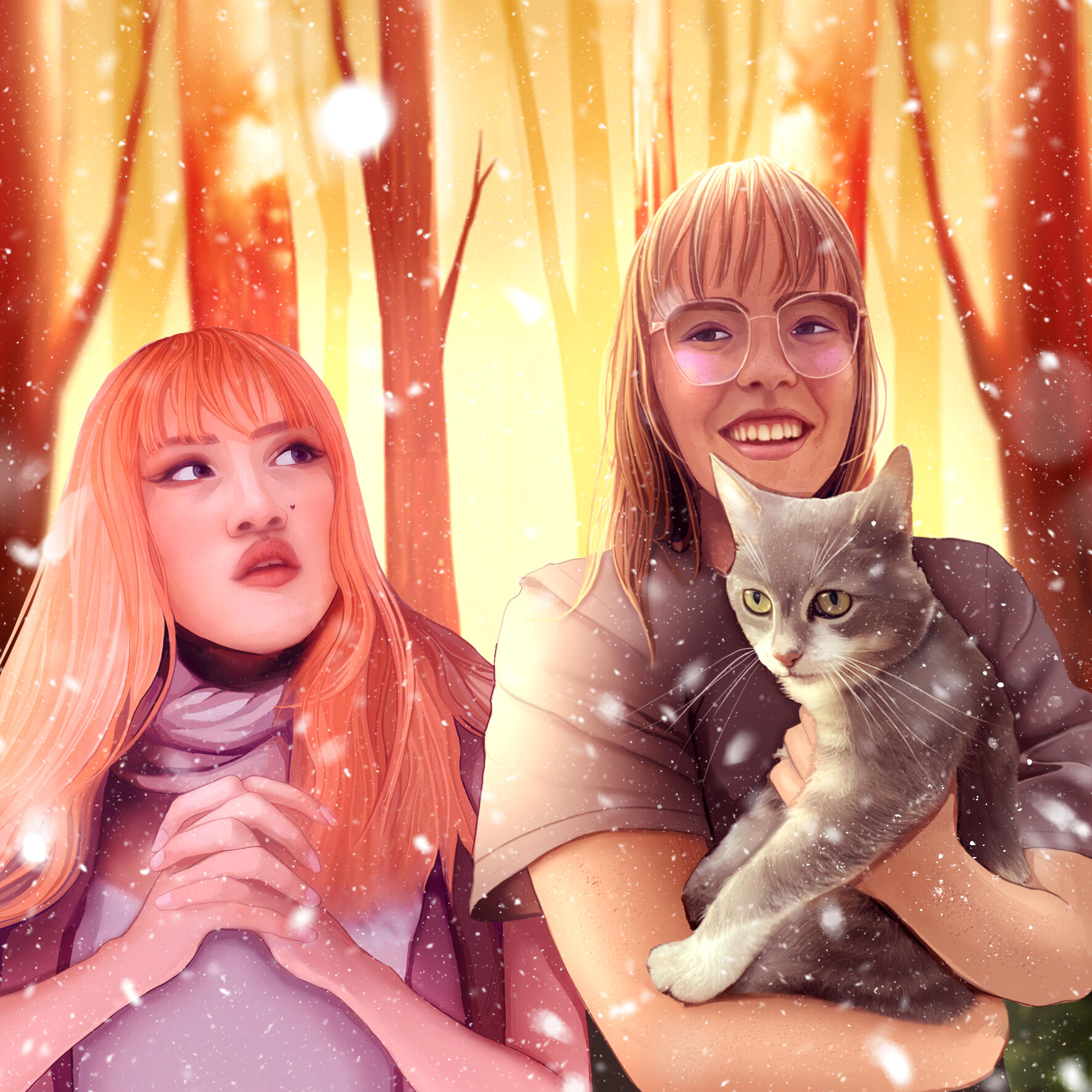
This was a Christmas gift I painted and animated for my best friend! The song used that inspired this is Gold Rush by Taylor Swift.
Filmmaking
Over the past four years, I've accumulated experience in video / audio editing and production through filmmaking classes such as Digital Storytelling and Advanced Digital Cinema. As a mixed-media specialist, I usually incorporate animation alongside recorded film. In particular, some themes that I enjoy exploring are marginalized identities, interpersonal loss, and intergenerational trauma. These projects intermixed Premiere Pro, Paint Tool Sai, Adobe Animate, and Adobe Audition.
AN ETERNITY WITH YOU
PROMPT: Work on your technical and storytelling skills at the same time in a mixed media video project, referring to a film or video that uses different types of media forms. Use 5 of the 6 things listed below:❥ Digital animation
❥ Green Screen
❥ Analog animation
❥ Sounds or voice over that you record yourself
❥ Music that you compose and record yourself
❥ Found Footage
This was a music video project I created for my Advanced Digital Cinema class. I worked on filming, video editing, music composition, singing, art, and animation. This storyline follows Guuji Yae, swapping back and forth between the past and present — with her current self trapped in an old vintage TV, and her past self depicted in the 2D / illustrated world. She is seen attempting to cope with the heartbreak of being left behind by her lover, the Raiden Shogun (Ei), who cast herself away in the Plane of Euthymia. By the end, Guuji Yae is seen contending with reality, oscillating between animation and reality as she struggles to come to terms with her loneliness and heartbreak. Guuji Yae is still stuck in that room, mirroring the first shot — as stagnant as the day Ei left her. The video ends flickering as if the TV is broken, stuck in static for the rest of eternity.
The majority of the content is filmed, drawn, or recorded or animated by me. However there is some found footage requirements — meaning drawing footage from pre-existing sources — that includes animations of the Raiden Shogun from Genshin Impact. I composed & recorded the music and voice via microphone & guitar in Soundtrap, but the song itself is Right Where You Left Me written by Taylor Alison Swift.
SOURCES:Inazuma: Omnipresence Over Mortals. Genshin Impact, Cai Haoyu. Directed by Cai Haoyu. Mihoyo, August 2, 2021.Swift, Taylor. “Right Where You Left Me.” Sony / ATV Tunes LLC.
OMNIPRESCENCE OVER MORTALS
PROMPT: Use your editing choices to enhance a film / series reception as a different genre by paying attention to the tone and pace. Edit a trailer between 1 minute and 3 minutes long.This is a showcase on video and audio editing skills, not production! Sources for music and content is down below.
For this assignment, I chose the story of Omnipresence Over Mortals, which is based on the lore of the webcomic and video-game Genshin Impact. This narrative’s original genres are action and fantasy, following the linear plot of exploring the unknown, perilous land of Inazuma. It follows a standard hero's journey plot: with the main goal being confronting Raiden Shogun, a tyrannical ruler who is enforcing an unjust vision-hunt decree on her people. While the actual protagonist is a character named Aether, I thought it would be interesting to instead shift the focus onto Kazuha, a side character whose lore was filled with much more provocative drama and interpersonal / romantic subtext. Hence, the main genres I switched from were fantasy / action to drama; moving from broad, thrilling action into a much more specific set of personal experiences.
Hence, I tried to limit the amount of action and instead pulled from scenes revolving around Kazuha’s loss of his beloved partner, a nameless friend referred to as “Tomo”. As a result, the only action scenes I included were those from the killing blow of the Raiden Shogun on the day of Tomo’s death. Paired with the lyrics “you made me hate this city,” from Billie Eilish’s song, Happier Than Ever, I wanted to emphasize how she ruined the concept of home for Kazuha both literally and figuratively through killing his loved one, enforcing an unjust decree onto her people, and sending him into a life of endless wandering as a fugitive.
I used instrumental music up until the chorus, where I merged the audio with the original song to explode into the original lyrics / rock music at Tomo’s death. From here, I gradually transitioned the audio back into a wordless violin / piano cover by Joshua Sabarma as the narrative unfolds into Kazuha’s period of grief. This was intended to convey the more serious tone of dramatic movies, encapsulated by a story with high stakes, conflict, and emotionally-driven characters who move towards a clearly defined goal. As this is ultimately a trailer, however, I left whether or not Kazuha ended up confronting Raiden Shogun open-ended / implied for the viewers to find out for themselves.
SOURCES:Inazuma: Omnipresence Over Mortals. Genshin Impact, Cai Haoyu. Directed by Cai Haoyu. Mihoyo, August 2, 2021.Eilish, Billie. “Happier Than Ever.” Spotify.
https://open.spotify.com/track/4RVwu0g32PAqgUiJoXsdF8?si=b77a84b2c2794a6Sabarma, Joshua. “SWP Collections VIOLIN Instrumental Cover,” Youtube, Aug 9, 2021.
BLACK HISTORY MONTH
PROMPT: A 30 sec to 1 min long video commemorating Black History Month.
This was a project I drew and animated for the WSU Recreation Center commemoration important Black figures throughout WSU history. The song used is I'm Here by Cynthia Erivo!
THE DEATH OF EGO
PROMPT: Create a compelling storyline and narrative.
This was a project I personally animated for Digital Storytelling. It follows the story of an apocalypse survivor conversing with a God as she cleanses the world in the aftermath. The ost used is Flowers by In Love With a Ghost!
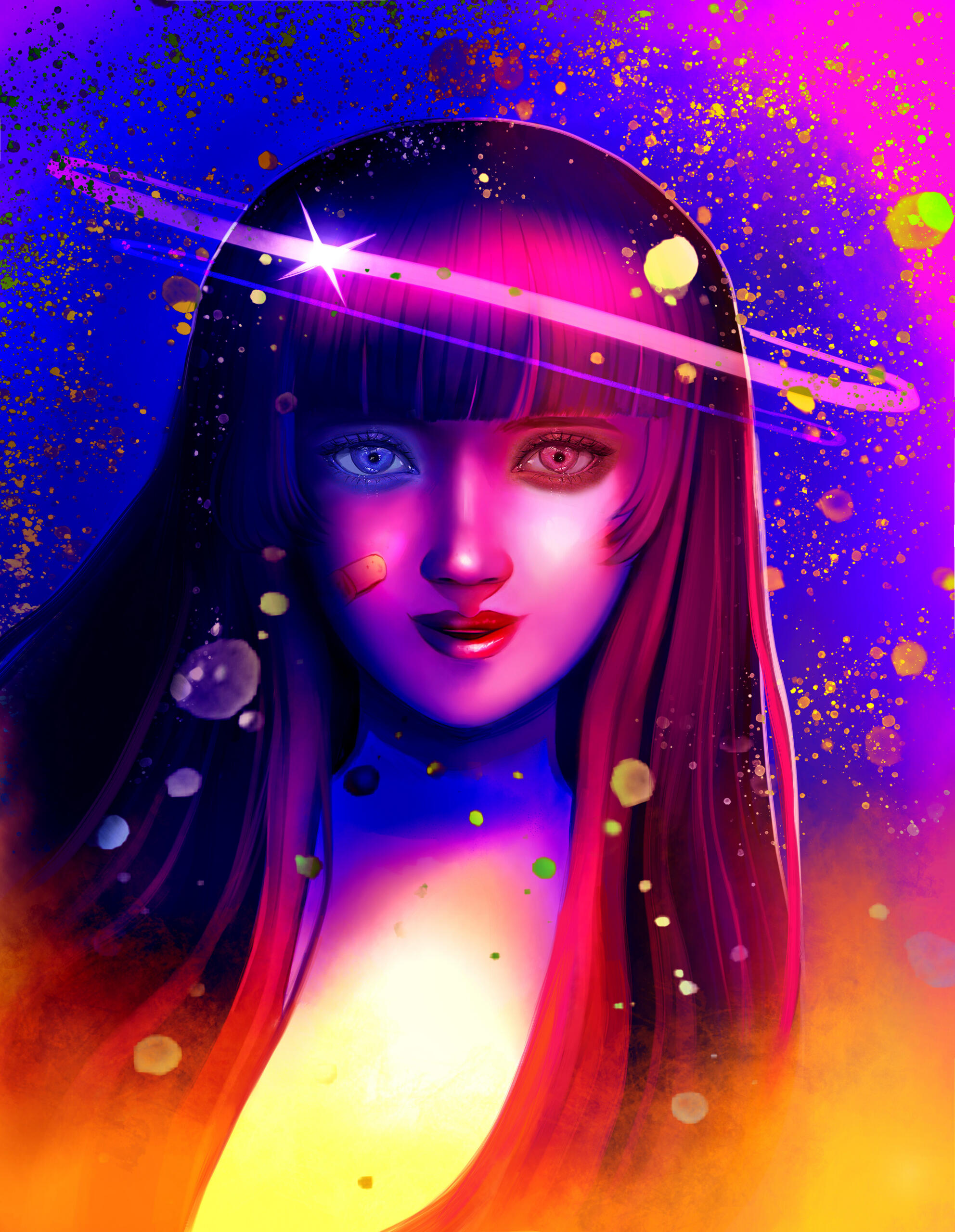
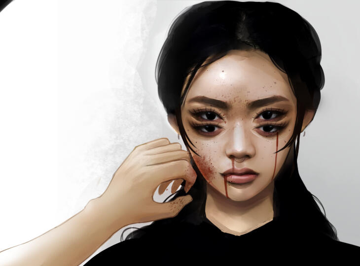
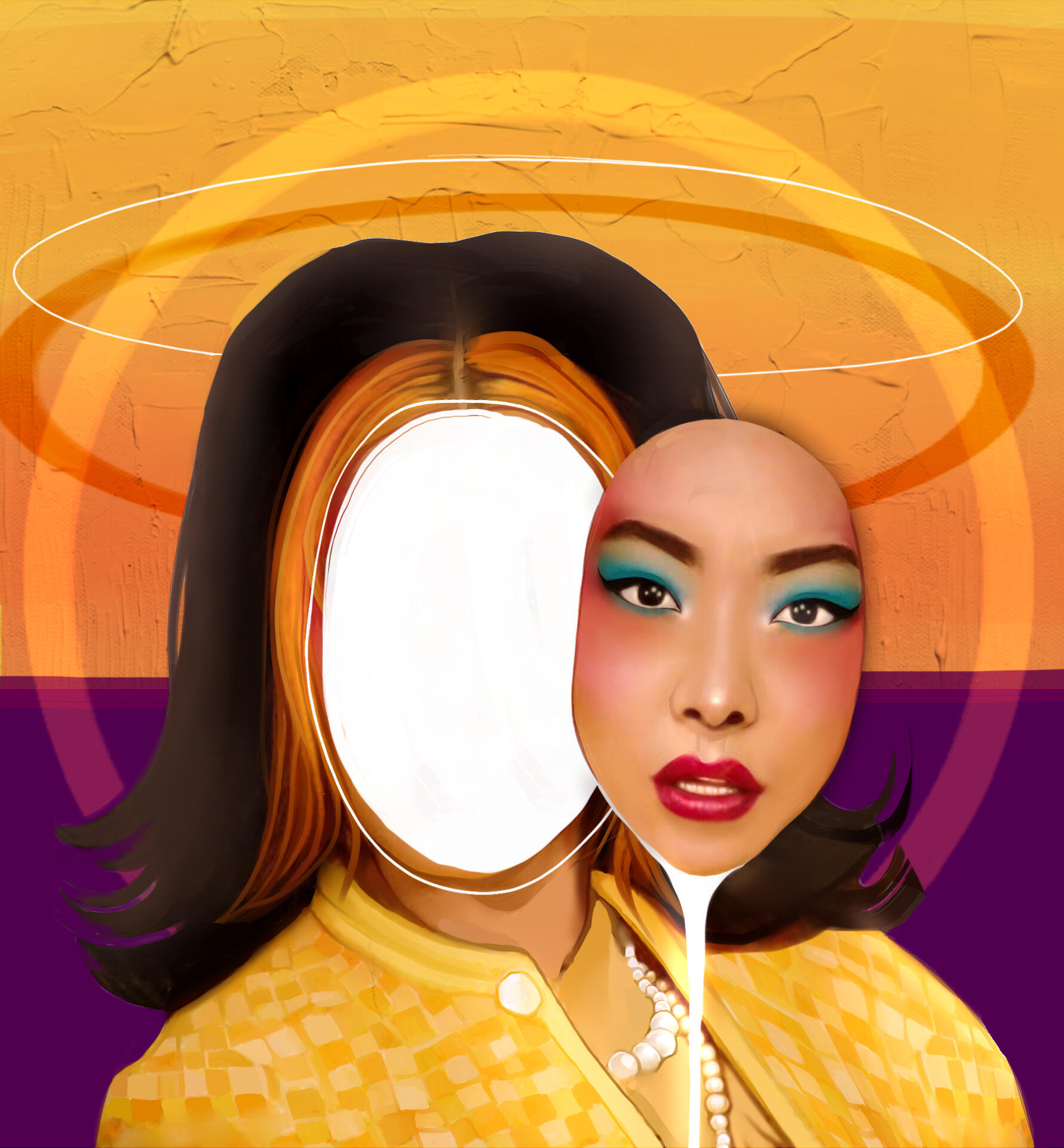
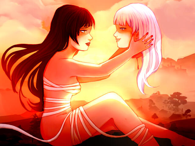
Abstract-Realism
It's a popular opinion that realism is the epitome of art: that art in its final form is meant to reflect reality. Nonetheless, I believe that the capacity to conceptualize real-life objects into alternate, abstract mediums is part of what makes art so compelling. Hence, I enjoy adding layers of unrealism to these pieces to show a sense of connection between art, abstraction and reality. For my semi-realistic pieces, I usually draw in either Paint Tool Sai or Adobe Photoshop.
KOMBOOZA BRANDING
Kombooza is a drink that combines the health benefits of kombucha and the fun of a friday night! Contrasting cool & warm color schemes, Kombooza encapsulates the duality in a fruity, summer drink with an alcoholic edge — further characterized with the use of warp text.
Kombooza's iconography is based on the phrase "Kombooza with a buzz" — hence, the use of bee imagery over fruit, utilizing a semi-realistic painted style. While the main typeface is warped, informational text is kept intact for accessibility and organization. Fruit imagery is use in tandem with alcoholic cans, emphasizing Kombooza's dichotomy.
There are two sets of bee icongraphy: 3-colored and 15-colored sets to use in detailed posters vs typographic merchandise.
Merchandise, Billboards and Posters:
ITCH.IO GAMES
A compilation of the games I've developed or designed for various projects. I'm experienced with Bitsy, Twine, RPG Maker, and Renpy.
LUMERIA
This is a prototype of an RPG game that's still currently in production, created with RPG Maker XP using the Ruby language.
This is an RPG game I created which utilizes the concept of hypertext. I wanted to implement a storyline which would address the concept of mechanical reproduction and incorporate a more interactive narrative. Thus, I delved into themes of subjectivity vs objectivity and also played around with the debate of whether or not the virtual space is real or unreal.
The contradiction within the concept of a hypertext-based game is that it inherently assumes the existence of free will within its narrative — both the creation and significance of the storyline is dependent on both the agency of its player (or players) and audience (or audiences). The purpose of branching storylines is to immerse the player in a world they carve for themself—yet, the overarching plot is still ultimately determined by its creator. This raises the question: can games truly emulate “reality” if its storylines are predetermined? In the first place, free will implies a world which is not inherently structured, but rather, one which is shaped by our own choices. Yet as we are bound by the laws of physics, properties of matter, and the inescapable occurrence of Death, the concept of free will is both limited and isolated. As multifaceted and complex beings, no human can never truly understand another completely. This implies separation and estrangement to be an inevitability of human existence. Therefore, if we are inherently limited, isolated, and only exist both corporeally and consciously to a temporal extent, then perhaps free will is unable to exist in both the real and virtual space.
DEAD END
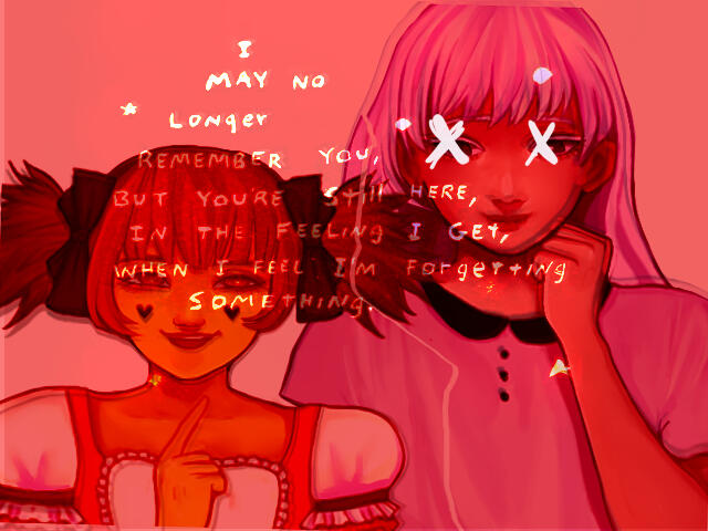
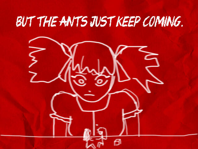
These were drawn for a pixel-styled Visual Novel game I made with a group using Piskel. I was one of two artists, working with two other storywriters and coders! This style emphasizes detailed rooms, architecture, and buildings while retaining abstraction. It requires symmetrical precision paired with interesting asymmetry, as well as high contrast between black and white outline / filling.
WHELAN CEMETARY: TAROT CARDS OF LIFE AND DEATH
This is a project that I worked with a team of designers — tackling the creation of a design system for the Whelan Cemetery of Pullman, Washington. Within said group, I acted as the character illustrator, primary card designer and overall supervisor for design work. Our group portfolio can be found here, and my personal character design process can be found here.
CARD ILLUSTRATIONS
Here's a closeup of the characters I drew! My process consists of starting in greyscale before overlaying watercolor + halftone textures, values and color. After discussing our design system with the team, we settled on a monochrome-based color scheme with thin line-art, abstract/stylistic, and Victorian era clothing to match gothic font associated with Whelan Cemetery.
Here's my first sketches of ideation — I thought: how can we visualize an interesting relationship between character, story and flower? What kind of outfits should we create to convey the Whelan Cemetery aesthetically? Should said outfits be consistent in “era” or can we play around with different clothings, such as xianxia for one and Victorian for another? Should we have humanoid or more abstract forms? Hence, I played around with textures, color schemes, lots of experimentation with form.
ARCANE VINYL
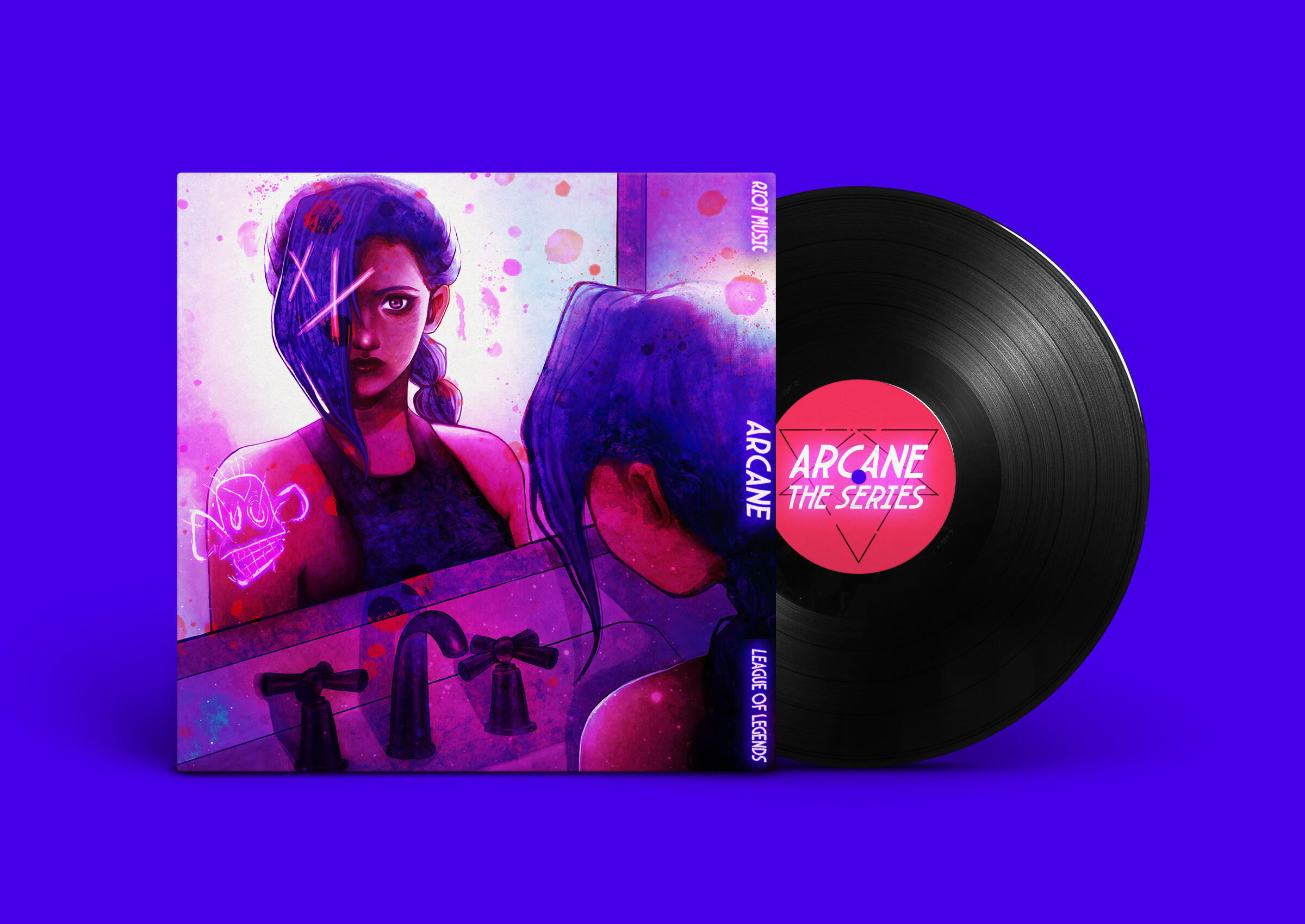
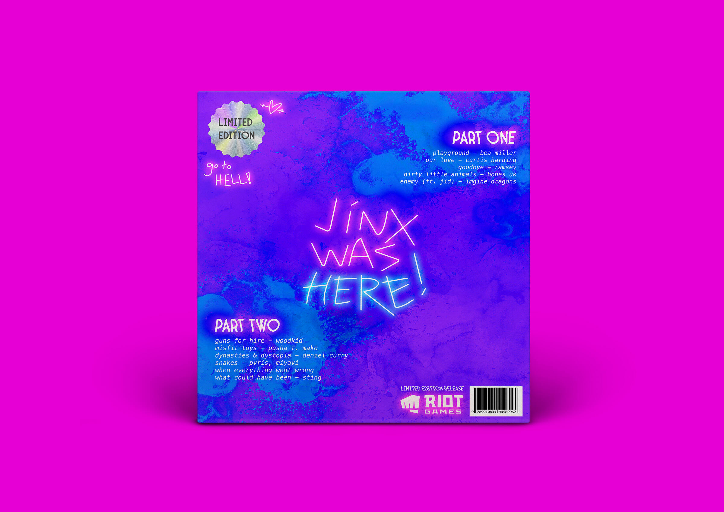
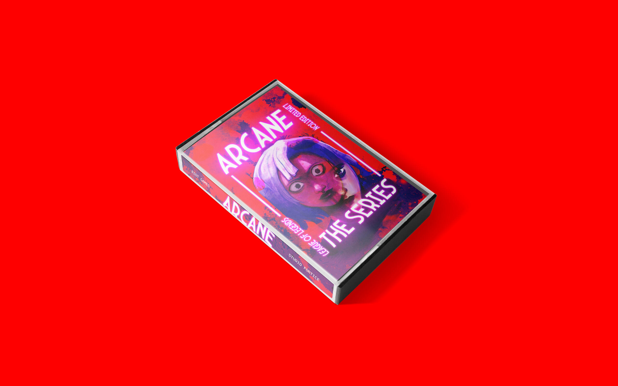
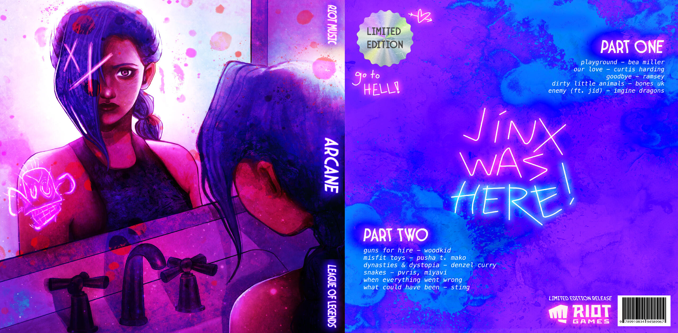
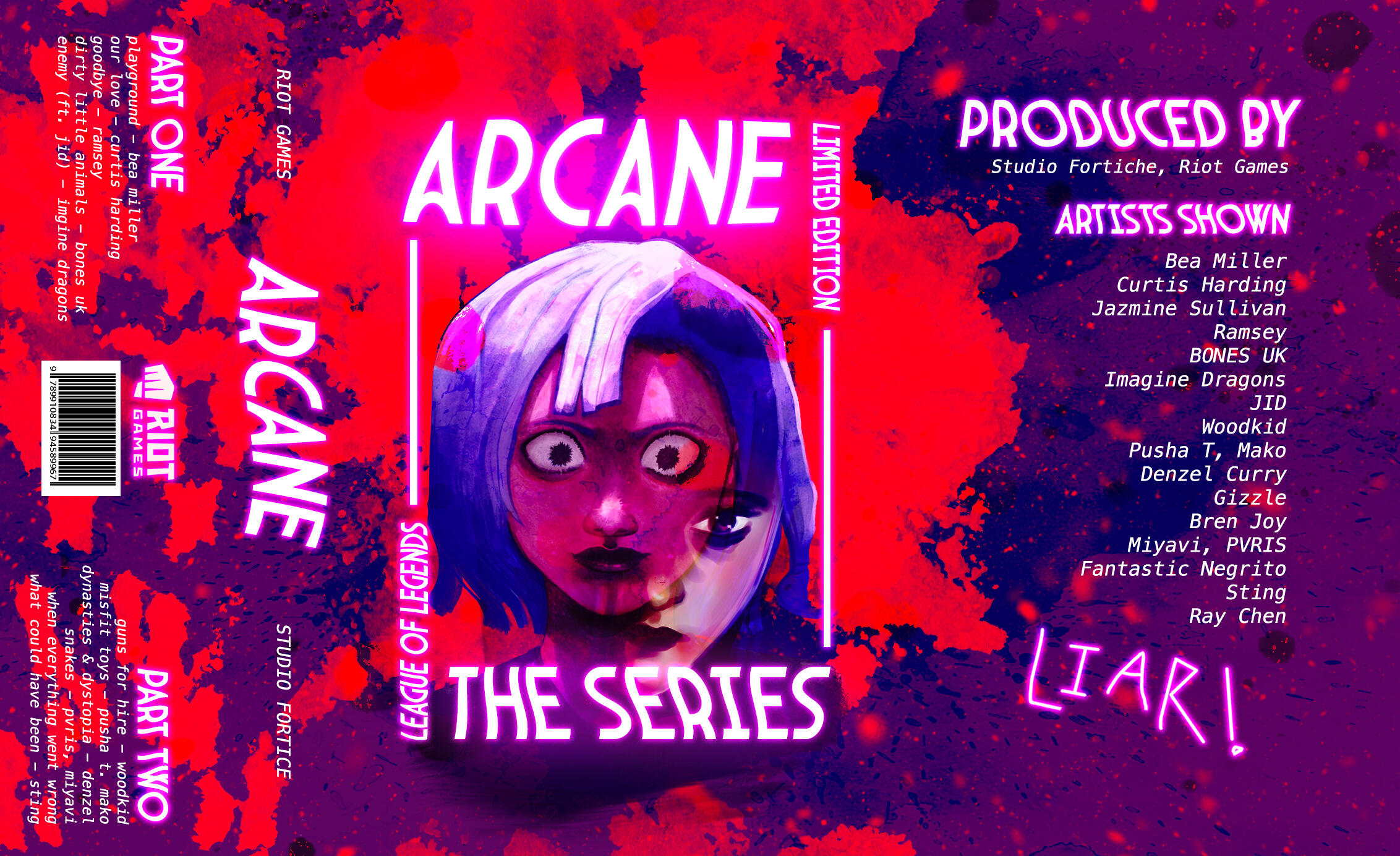
This is an vinyl album cover I created for the album Arcane — a multi-artist soundtrack based on the animated show Arcane, produced and written by Riot Games. The show cycles through strong themes of familial trauma, mental illness, and complex interpersonal relationships explored through neon, graffiti-like designs. I pulled these concepts into this album design, playing around with abstract colors, sketchy textures and neon backlighting.
THE YOUNG ELITES BOOK COVER
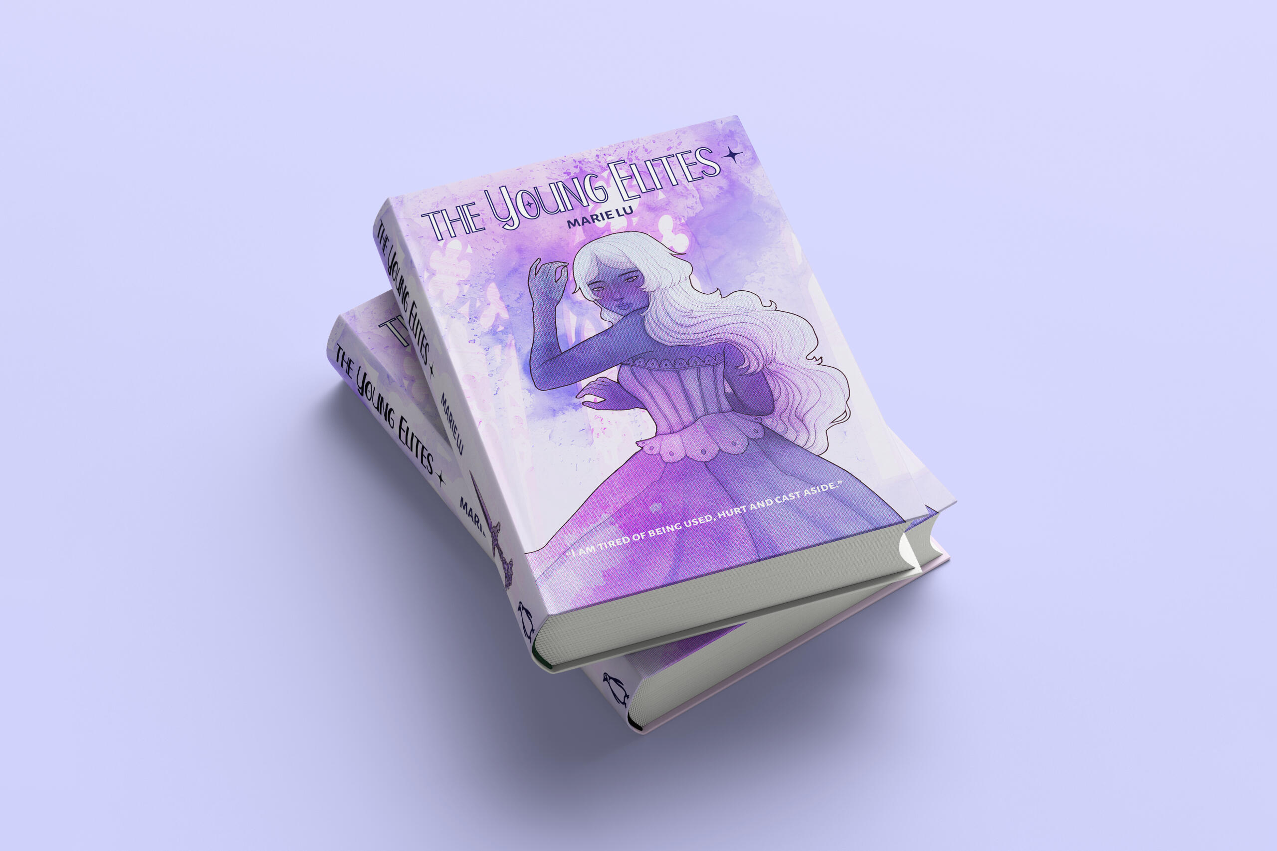
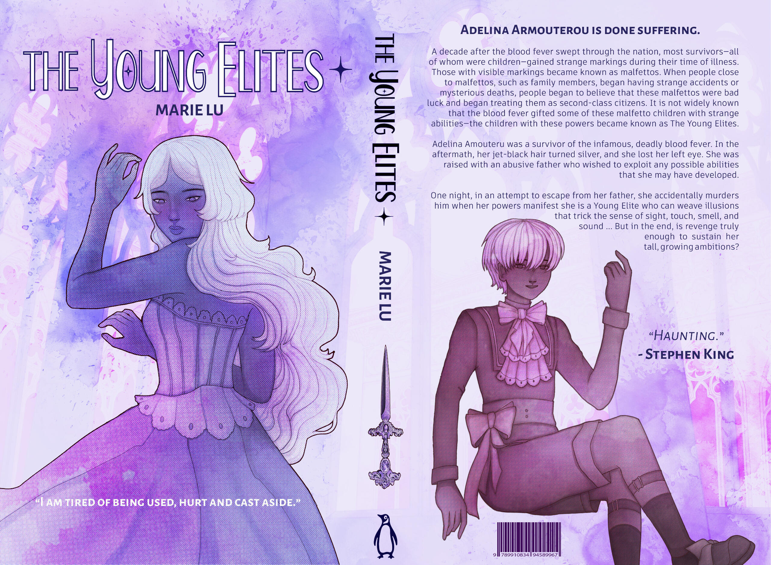
This design project was created for the Center for Washington State University's Center for Digital Scholarship and Curation, where I hosted an art workshop on scanning, digitization and painting.
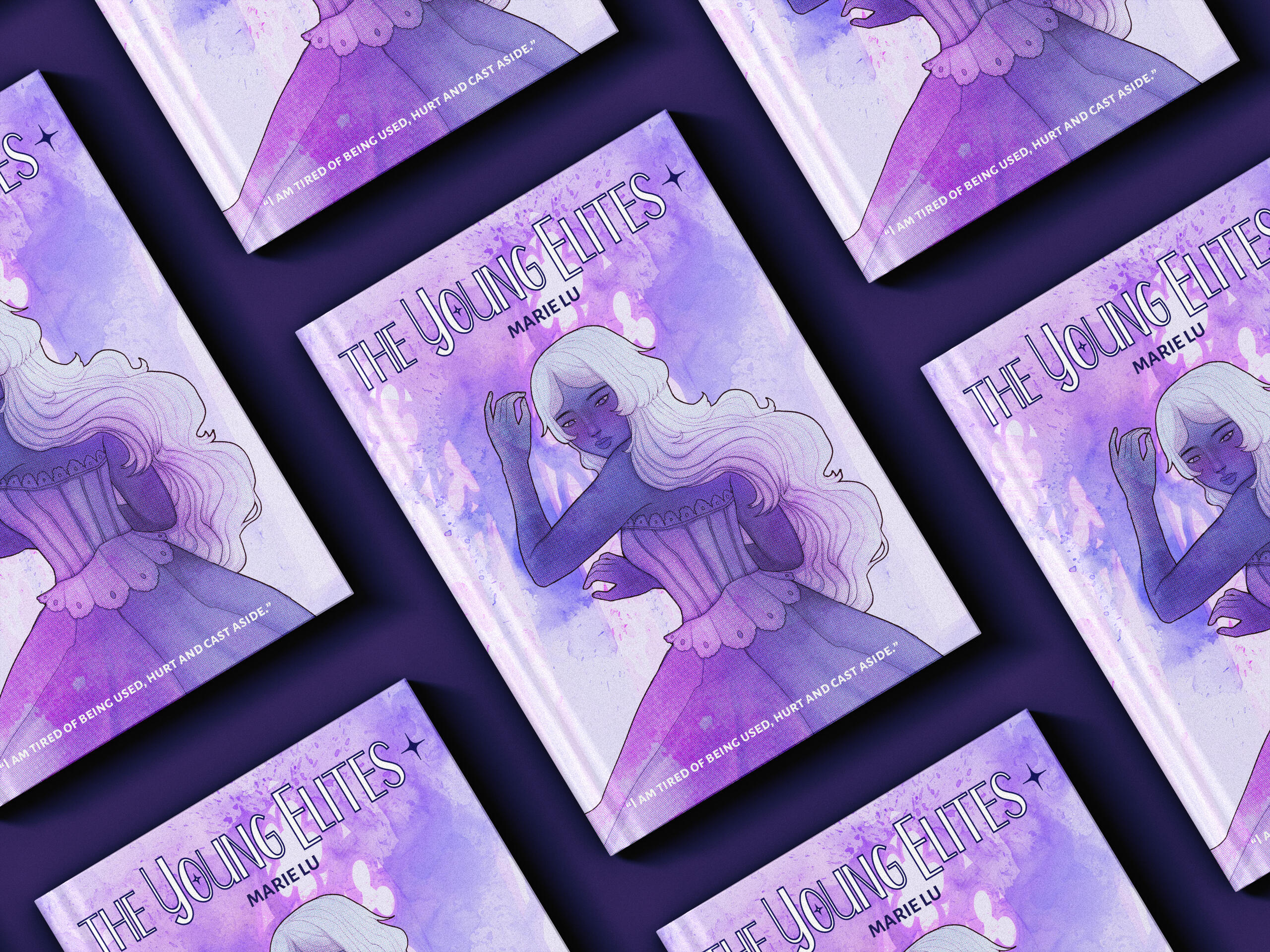
I designed this book cover with Julie White for the series The Young Elites by Marie Lu — a novel that follows the character Adelina Armeterou as she navigates the world as a 'Malfetto' reject. Here, we crafted a design system based on abstraction, watercolor and cool tones to match the fantasy historical setting of the series — set with a continuity of thin line art between typeface and illustration.

tokyo ghoul book cover
This is a book cover I created for the series Tokyo Ghoul by Ishida Sui — a manga that follows the protagonist Kaneki Ken through the ups and downs of college life...as a newly turned, human-eating ghoul. Hense, I utilized a grunge typeface paired with blood splatter incorporated within both text and illustrations to allude to the manga's violent themes. Nonetheless, the series is also about grey-area, othering mentality, and the beauty that remains in the "aftermath." As Ishida Sui has an elegant and beautiful art style, I wanted to show duality with Decorative Script as well as Sans Serif. When drawing the main figure, I wanted to utilize purple to convey a sense of peace, even amidst chaotic textures.
MAY/BE
May / Be highlights the theme of identity within the transitional space that is life. Our publication bolsters where our contributors are as well as where they hope to be in the future by leveraging their current works individually and their collaborative or community efforts. Using a collaborative method, each member interviews and highlights another colleague by asking thoughtful questions and formatting the layout to promote their assigned peer.
Below are the spreads I designed for my fellow collaborator, Mariah Johnson using her own assets and self portrait. I crafted a design system off of her personal interests, such as video games, the color lavender and old RPG styles.
QUEERING THE OCEAN
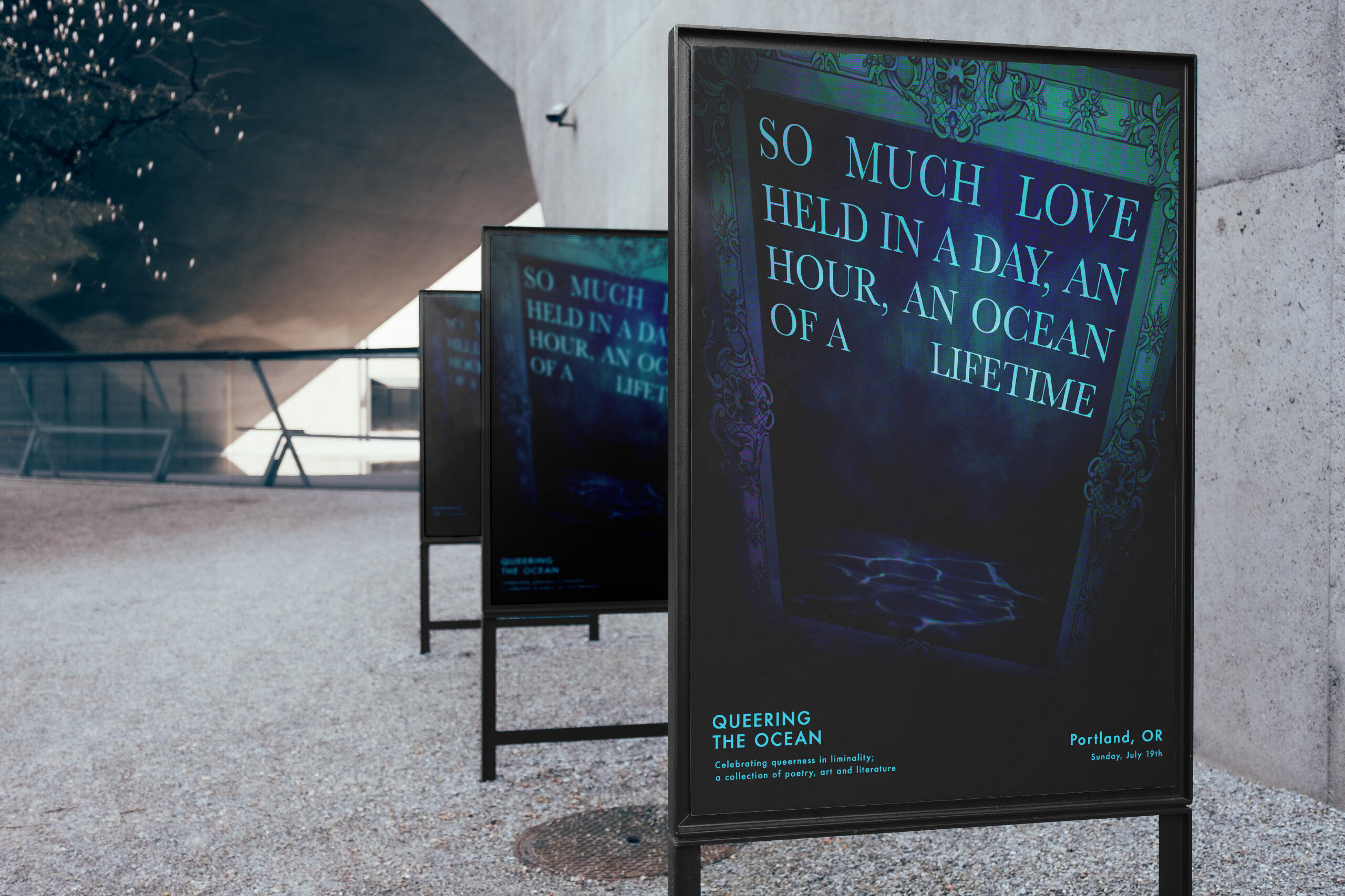
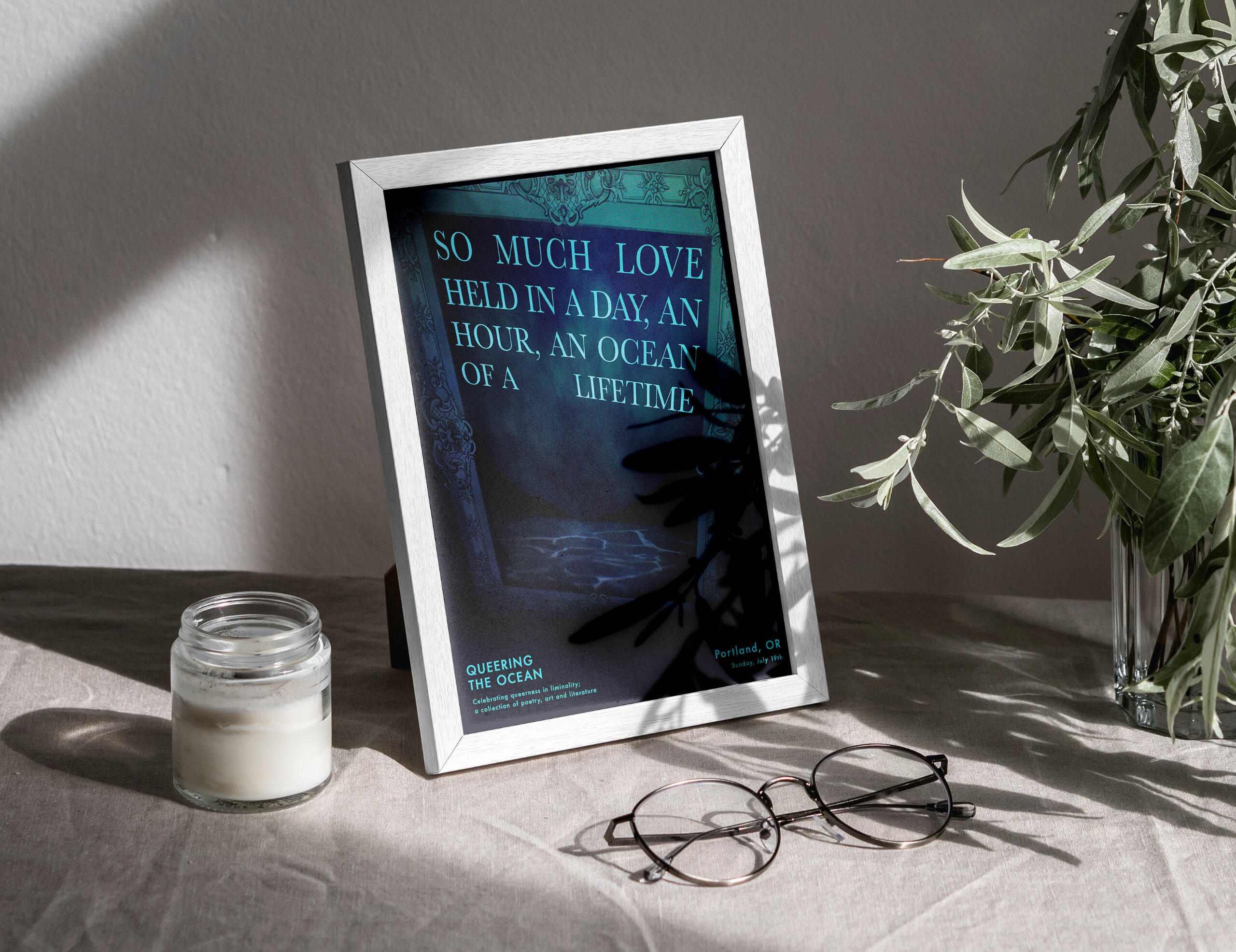
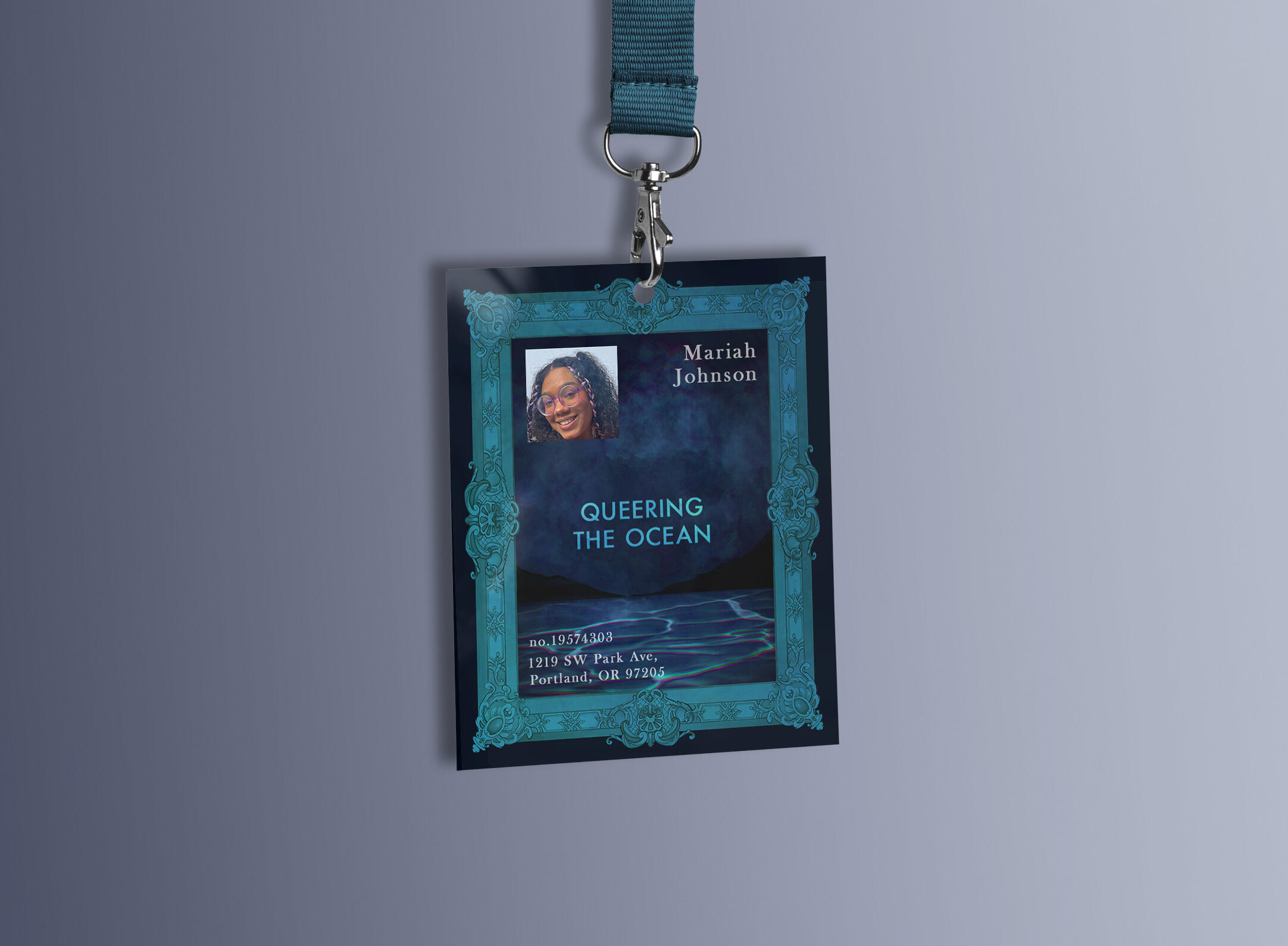
Waves are disorienting to time. They leave as soon as they arrive, they pull, they move, they flow and overlap and exist as remnants of each other, revivals, interactions. So, how can the ever-moving be defined in geometric lines? There is something innate, both about queerness and the ocean, that is compelled to be intangible and unconfined to the straight line of a horizon.In this, queerness is freedom. If I stand with my shoulders under and don’t fight the wash of the tide, then the surges don’t knock me like they could. I just sway slightly.
OCEAN PROCESS
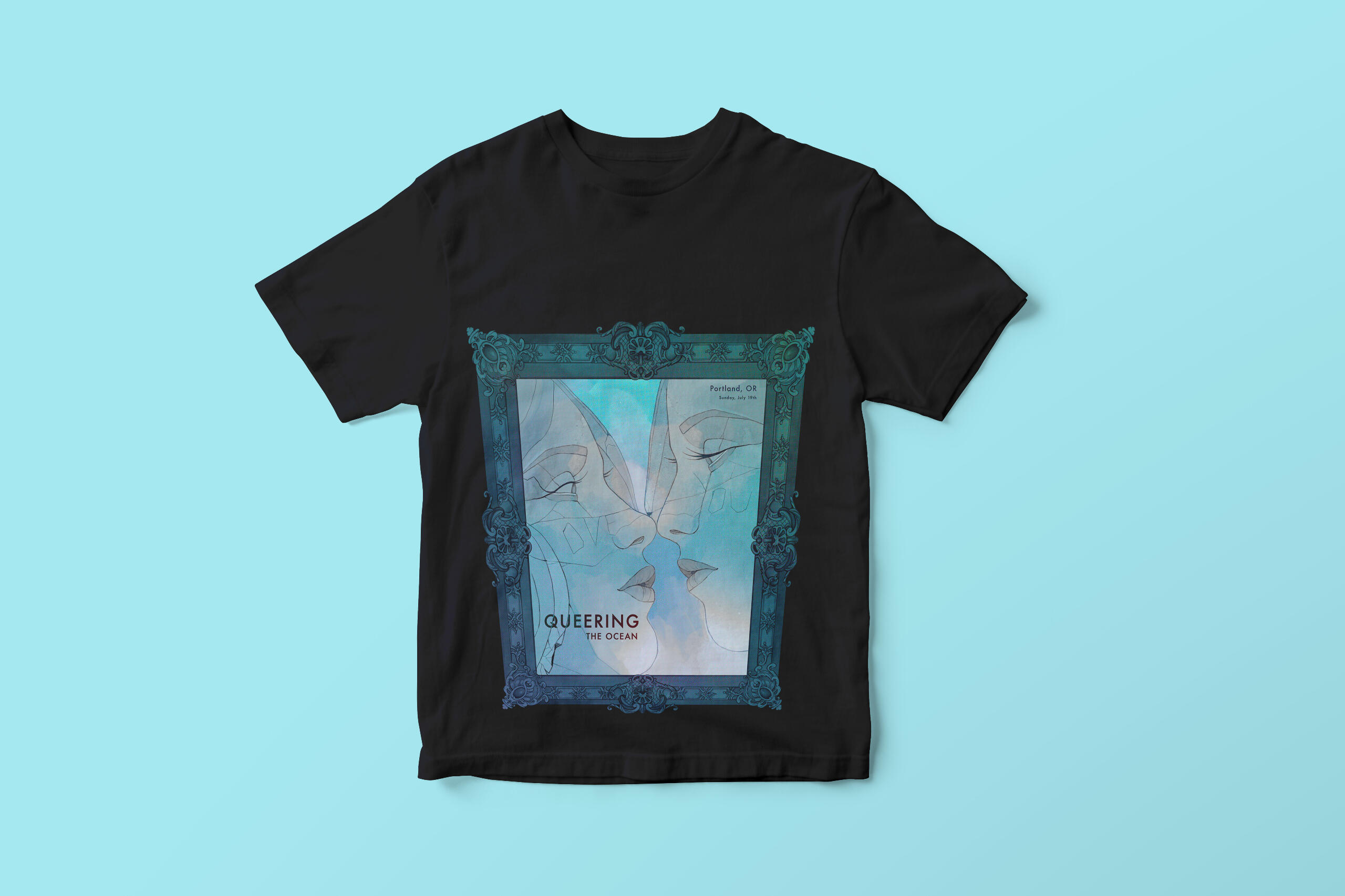
This event connects the liminality of the ocean to queerness. Based on this idea, I shaped my designs around themes of the aquatic. This was done using a blue color scheme with hints of chromatic aberration in the water as well as in the halftone effects I applied over the frame. Additionally, I illustrated themes of queer preservation for the T-Shirt designs – what is lost in history, over time, through depictions of deteriorating queer statues. I referenced art from the game Gris when illustrating the cracks on these statues. But while said statues may be falling apart in a literal sense, they are simultaneously immortalized in all their ruined, fractured glory within ornate frames. Ultimately, this event is about celebrating queer culture – both historically and contemporarily – through art and literature; addressing the open wounds of the past upfront; bringing visibility to the unspoken.


